Aesthetically, this isn't my strongest work. I was asked to finish this within 24 hours as the business wanted to go up the same day. However, this project taught me about client priorities, business realities and what success means in different contexts.
Create a brand identity for a new local car rental business that needed to launch immediately, in the same day. Push Start Hire specialised in higher-end vehicles (VW Golf R, C-class mercedes, M series BMWs, etc) aswell as practical run arounds. The business mainly targeted clients within London.
The client's priority was speed over perfection. I was tasked with creating a logo, vehicle overlay templates for social media, and a pricing/ terms & conditions page. All to go live within the day.
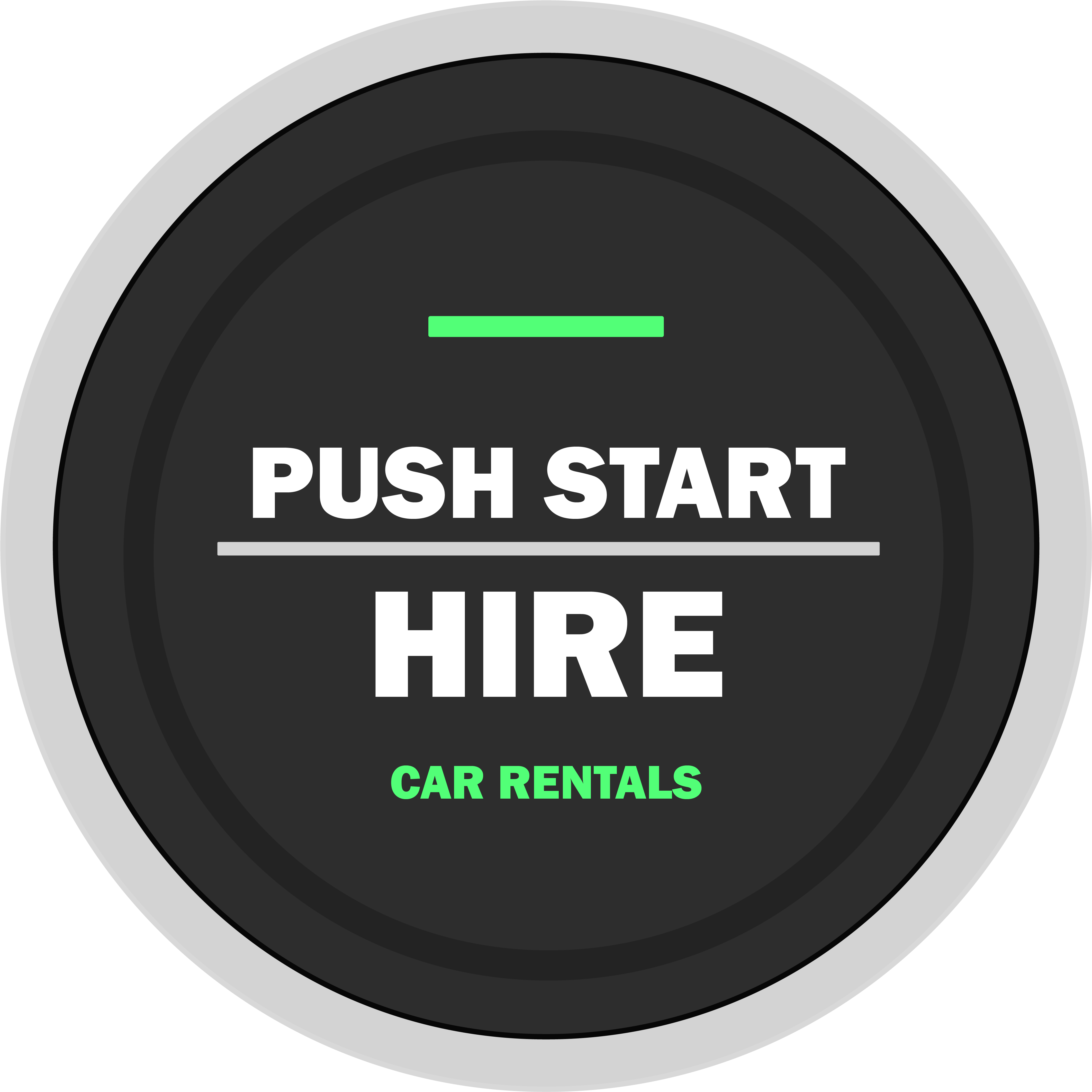
Logo Design
The company name immediately made me think of the push to start ignition as a logo. I quickly designed the logo in Adobe Illustrator using simple shapes and colours. I included a green light bar as an accent to give it some more character and really sell the ignition button picture. The black and grey colours were chosen to keep it sleek and simple.
With such a tight timeline, I had to trust my instincts and commit to the first few concepts and present them to the client. If I could go back, I would definitely change the typography as I think it looks a little bit childish.
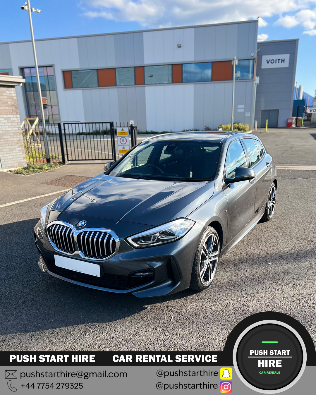
Overlay templates
Created instagram-ready templates to be overlayed onto the available cars. It contains the contact and socials of the business aswell as the logo.
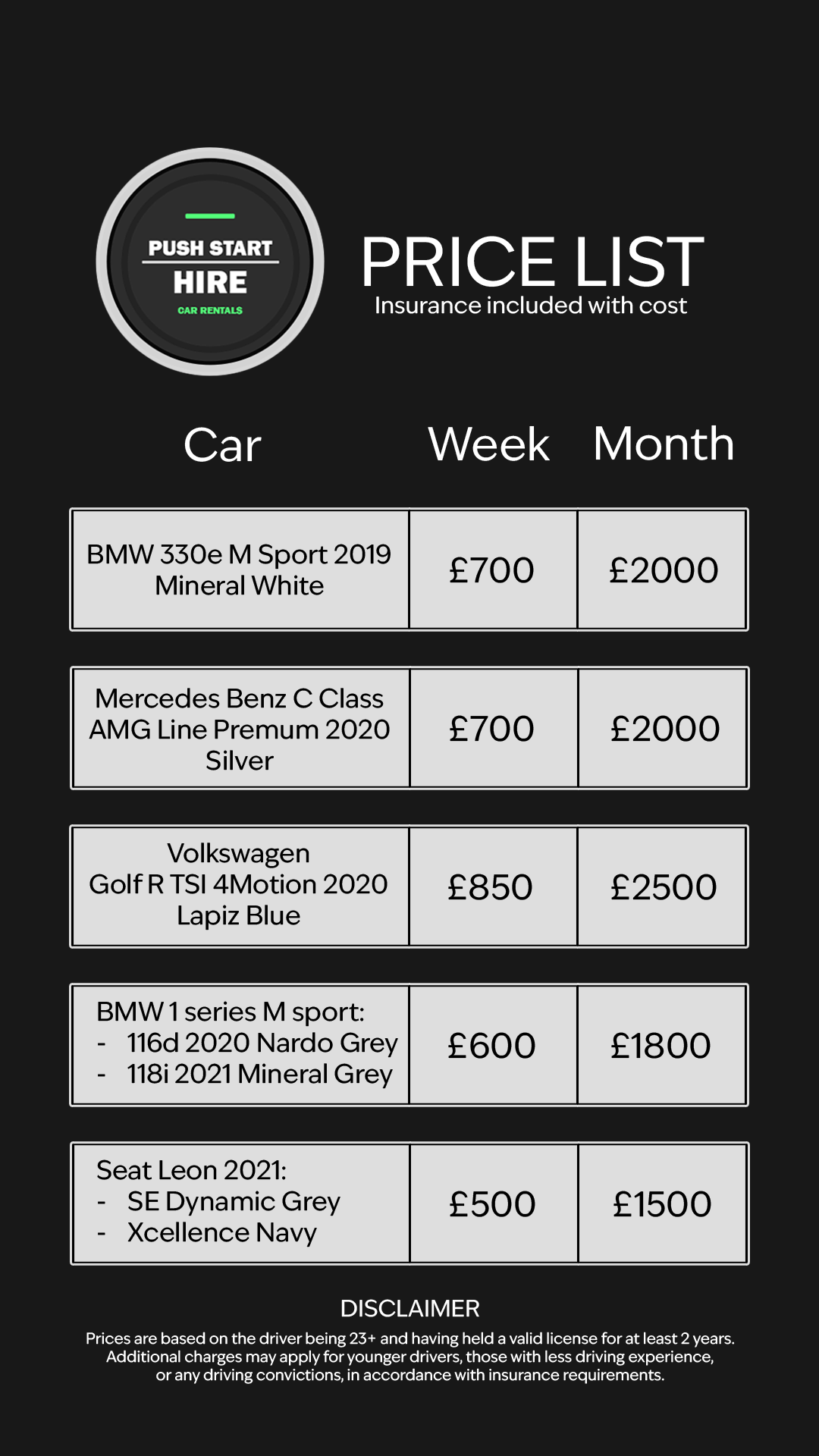
Pricing & T&Cs Page
Designed a layout to display the pricing, aswell as the terms and conditions. I focused on clarity and keeping a cohesive colour scheme on this layout.
Designed for speed and reusability across social media posts.
Black, grey and a green accent. These colours felt right for a project about automotives.
The first thing I'd change is the typography, the current typography does not feel very professional. I would probably still keep it sans-serif, but choose a more sleeker and thinner or uniform font. The second thing I'd change is the layout/ alignment of items. The alignment on some of the materials seem off in certain parts and gives it an amateur feel which I am not too proud of.
The business launched on schedule and it is actively using the branding across their social medias. The client was pleased with what was achieved within the timeframe, and feedback from their customers have praised the presentation. The cars are consistently rented out, which suggests that the branding is serving its purpose.